Photoshop GDW Game
Nax, The Pages of Sorcery
Objective: Take pictures of your GDW game and Photoshop them to make your game more appealing.
1. Main Menu (Original Version)
This was the original design of the main menu for Studio 6's game. The menu was created using Photoshop and had a couple of shading and lighting to the book.
(Edited Version)
This is the main menu after I have used Photoshop. I used the "Smudge Stick" from the "Artistic" filter to give the main menu more shadow and lighting effect to the book. This effect also gave more visibility to the words and made the book pop out more than the original version.
2. Book (Original Version)
(Edited Version)
This is the edited version after I have used Photoshop. I have used the "Glowing Edges" from the "Stylize" filter to make the book seem a bit more fitting to the rest of the scenery. This filter make the magical symbol seem to stand out more than the original version.
3. In-Game (Original Version)
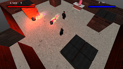
This is the original version for one of stages in our game. The particles and the light emitted were lacking, and the HUD was too stale.
(Edited Version)
This is the edited version after I have used Photoshop. I have used the blur effect to brighten the effects of the particles to make it seem brighter and shinier. I have also used the blur tool to darken the health and mana bars in the HUD to give it more depth.


